Chapter Analytics (officer/admin view)
Analytics is a core, always-on reporting surface — it isn't a licensable module and has no on/off toggle at the org level. As a chapter officer or president, opening Analytics in your sidebar gives you the rich, multi-tab view of your own chapter's health: KPI cards, a metric trend chart, and cohort retention. Regular chapter members reach the same nav item but see a much simpler read-only card instead — see What regular members see instead.
What you see
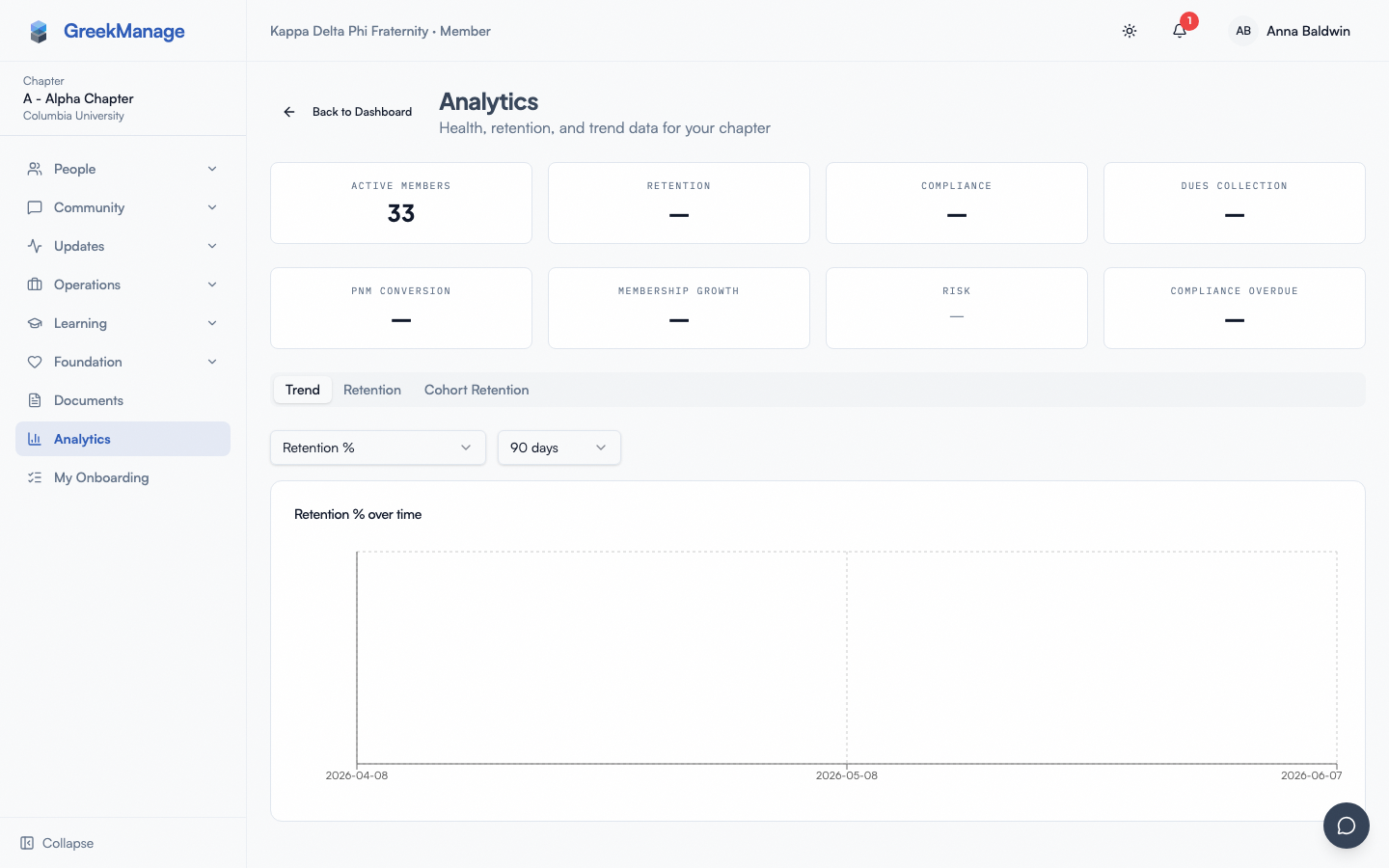 The chapter Analytics dashboard: KPI cards and the Trend tab.
Open Analytics from your sidebar and you land on your chapter's Analytics dashboard, with three rows of KPI cards at the top (10 total):
- Total Members — plain count; the whole roster except PNMs and disaffiliated members
- Active Members — plain count (undergrad + associate)
- Alumni Members — plain count (alumni, active alumni, lifetime alumni)
- Retention — percent
- Compliance — percent
- Dues Collection — percent
- PNM Conversion — percent (only when your org is licensed for the Operations module, which is what gates recruitment; otherwise the metric is absent, not zero)
- Membership Growth — percent (can be negative)
- Risk — a badge, not a plain number (see below)
- Compliance Overdue — percent
The three headcounts are not meant to sum: an inactive member counts toward Total but toward neither Active nor Alumni.
Why Retention sometimes shows "—"
Retention is a year-over-year comparison: your current active count against the active count recorded about 12 months ago. That baseline comes from the nightly snapshot store, so it exists only if a snapshot was actually captured back then.
The card shows "—" rather than a number whenever there is no snapshot within about two months of the 12-month mark — most often because your chapter had not been on the platform a year ago, or because its earlier history was imported at semester intervals rather than captured nightly.
That blank is deliberate. Comparing today against a baseline from, say, eighteen months ago would produce a percentage that looks exactly like a real retention figure while measuring something else entirely. A missing number you can see beats a wrong number you cannot.
The Risk card renders one of three states:
- isAtRisk is unknown → a plain "—".
- isAtRisk is true → a red badge reading "At Risk — {N} mo decline" (N is the consecutive-decline-months count, or 0 if not available).
- isAtRisk is false → a green outline badge reading "On Track".
Below the KPI cards sit three tabs: Trend, Retention (only if your org has the Operations module enabled), and Cohort Retention.
Trend tab
Above the chart, two controls:
-
A metric dropdown with all 11 metrics available anywhere in Analytics: Total Members, Active Members, Alumni Members, Retention %, Compliance %, Dues Collection %, PNM Conversion %, Membership Growth %, Consecutive Decline, Compliance Overdue %, Critical Compliance %.
The three headcounts are plain counts rather than percentages, so they are the ones to pick when you want to see the chapter's actual size over time rather than a rate. They do not appear as columns on the org-level Chapter Health Heatmap: that grid colours every cell red/amber/green against a threshold, and a headcount has no threshold to be measured against.
-
A date-range selector: "30 days" / "90 days" / "1 year" / "All time", defaulting to 90 days.
The chart is a single-metric line chart — one line for whichever metric is currently selected, plotted over the chosen date range. If there's no data yet for your chapter, the tab shows: "No trend data yet. Snapshots collect nightly."
Cohort Retention tab
This is the same CohortChart component used at the org and region tiers (see Analytics dashboard (org & region) → Cohorts tab for the full mechanics — the "Joining Semester" / "Pledge Class" toggle, cohort-labeling rules, chart behavior, and empty state are identical). The one difference at the chapter tier is the tab's name: here it's labeled "Cohort Retention", not "Cohorts".
Retention tab
If your org has the Operations module enabled, a Retention tab appears alongside Trend and Cohort Retention, hosting the same chapter retention dashboard used elsewhere in the platform. This page doesn't re-explain that mechanics — see:
- Retention and surveys (for officers) — the officer-facing depth on this same dashboard: KPI cards, alerts, and the acknowledge/resolve workflow
- Analytics Retention tab — post-enable runbook — enabling and first-30-minutes setup
- Retention snapshots and alerts — the full alert lifecycle and severity rules
Understanding the color coding
The KPI cards' companion surfaces elsewhere in Analytics (the org/region Chapter Health Heatmap and Comparisons table) and this page's own per-metric values all follow the same traffic-light thresholds:
| Metric | Green | Amber | Direction |
|---|---|---|---|
| Retention % | ≥ 85% | ≥ 70% | higher is better |
| Compliance % | ≥ 90% | ≥ 70% | higher is better |
| Dues Collection % | ≥ 90% | ≥ 70% | higher is better |
| PNM Conversion % | ≥ 50% | ≥ 25% | higher is better |
| Membership Growth % | ≥ 0% | ≥ -10% | higher is better |
| Compliance Overdue % | ≤ 5% | ≤ 15% | lower is better |
| Critical Compliance % | ≥ 95% | ≥ 80% | higher is better |
| Consecutive Decline (months) | ≤ 0 mo | ≤ 2 mo | lower is better |
Two of these eight metrics are inverted from the rest — Compliance Overdue % and Consecutive Decline are "lower is better." Anything outside the amber range renders red; no data for a metric renders gray. See Analytics dashboard (org & region) → Understanding the color coding for the org/region-tier version of this same table (identical thresholds — it drives the heatmap and comparison table there instead of KPI cards).
Note that a chapter has no Comparisons tab — that tab only exists at the org and region tiers, since a single chapter has nothing to compare itself against within this feature.
What regular members see instead
Non-officer members who open the same Analytics nav item don't get this tab at all — they see a much simpler, read-only Chapter Snapshot card showing a subset of these same metrics (whichever ones your org admin has made visible to regular members). See Chapter Analytics snapshot (for members) for what that looks like.
Related
- Analytics dashboard (org & region) — the org/region-tier equivalent of this page, for national and regional admins
- Chapter Analytics snapshot (for members) — what a regular chapter member sees instead of this tab
Last verified against v0.65.25 (2026-07-05). Analytics module + Retain/Surveys consolidation, v0.65.0. This page was previously undocumented.