Analytics dashboard (org & region)
Analytics is a core, always-on reporting surface — it isn't a licensable module and has no on/off toggle at the org level. National admins reach the full org-wide view at /org/analytics; regional admins reach a region-scoped view at /region/analytics that's almost identical, minus one tab. This page walks both tiers together, since they share nearly all of their UI.
What you see
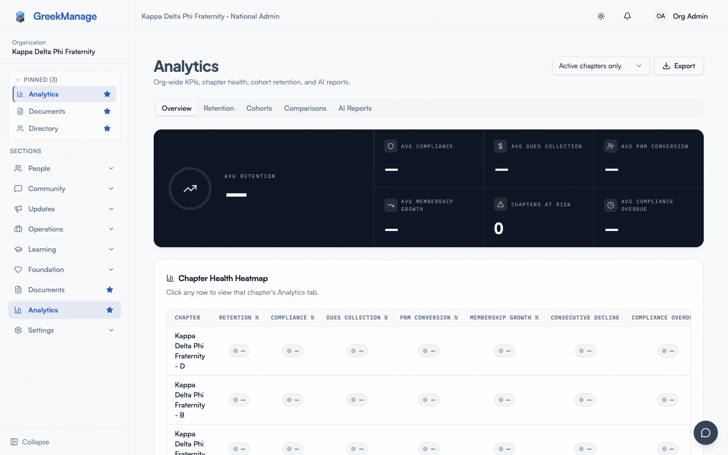 The Analytics dashboard: Overview tab with the KPI deck and Chapter Health Heatmap.
Both pages share the title "Analytics". The subtitle differs slightly by tier:
- Org tier: "Org-wide KPIs, chapter health, cohort retention, and AI reports."
- Region tier: "Region-wide KPIs, chapter health, and cohort retention." (no mention of AI reports, since that tab doesn't exist here)
Above the tabs, both tiers show the same two controls:
- A chapter-status filter dropdown: "Active chapters only" (default) / "Active + Inactive" / "Active + Suspended" / "All chapters". Inactive and suspended chapters can skew org-wide or region-wide averages, so the Overview KPI deck, heatmap, cohort chart, comparison table, and export default to active chapters only and let you opt the others back in. The Adoption tab's headline numbers are the one exception — see Adoption tab below.
- An Export dropdown with two options: "Download CSV" and "Download Excel (XLSX)".
The tabs themselves differ by tier:
| Tier | Tabs |
|---|---|
| Org | Overview, Retention (if Operations enabled), Cohorts, Comparisons, Adoption, AI Reports |
| Region | Overview, Retention (if Operations enabled), Cohorts, Comparisons, Adoption — no AI Reports tab |
Only national admins reach /org/analytics (further filtered to national-admin scope in the org sidebar); regional admins reach /region/analytics for their own region, and national admins can also open it. Nobody else can reach either route.
Overview tab
KPI deck
Seven KPI cards render at the top of the Overview tab, in this exact order, each animated with a count-up on load:
- Avg Retention — percent (this card is featured/wider than the rest)
- Avg Compliance — percent
- Avg Dues Collection — percent
- Avg PNM Conversion — percent
- Avg Membership Growth — percent (can be negative)
- Chapters At Risk — a plain count, not a percent
- Avg Compliance Overdue — percent
These are averages across whatever set of chapters the chapter-status filter currently includes.
Avg PNM Conversion is the one card here that depends on a license. Recruitment lives in the Operations module, so an org without Operations neither computes nor returns pnm_count, pnm_converted, or pnm_conversion_pct — the key is absent rather than zero, in new snapshots and in historical ones read back through the heatmap and comparison views. Every other metric on this page is unaffected.
Chapter Health Heatmap
Below the KPI deck sits the Chapter Health Heatmap card — title "Chapter Health Heatmap", description "Click any row to view that chapter's Analytics tab."
- One row per chapter, one column per thresholded metric:
retention_pct,compliance_pct,dues_collection_pct,pnm_conversion_pct,membership_growth_pct,consecutive_decline_months,compliance_overdue_pct,compliance_critical_pct. - The three headcount metrics (
total_members,active_members,alumni_members) are deliberately not columns here, even though they appear in the Comparisons dropdown and the chapter trend chart. Every cell in this grid is coloured red/amber/green against a threshold, and a headcount has no threshold — the column would be permanently gray, costing width on an already-wide table while telling you nothing. Use Comparisons to rank chapters by size, or a chapter's Trend tab to see its headcount over time. - Each cell renders as a color-coded "traffic light" badge — see Understanding the color coding below.
- Rows are clickable. Clicking a row navigates to that chapter's own Analytics view in-page, via a
?chapter={id}query param, with a "← All chapters" control to come back.
If there's no snapshot data yet, the heatmap shows an empty state: title "No snapshot data yet", description "Snapshots collect nightly — first data available tomorrow."
Cohorts tab
The Cohorts tab hosts a card titled "Retention by Cohort", description "Retention curves grouped by pledge class or joining semester."
Two toggle buttons control the grouping dimension:
- "Joining Semester" (the default) — groups members by calendar term. A join month of August or later is
Fall YYYY; a join month of June or July isSummer YYYY; a join month of May or earlier isSpring YYYY. - "Pledge Class" — groups members by academic year. A join month of August or later counts toward next calendar year's pledge class (e.g. joining in September 2026 puts you in "Pledge 2027").
The chart itself is a line chart with one line per cohort. When the selected metric is a percentage, the Y-axis is fixed to a 0–100 domain. The tooltip shows formatted values, a legend is shown, and lines render without dots at each data point.
If there's no cohort data for the current filters, the tab shows an empty state: title "No cohort data available", description "Try a different pledge class or joining semester range."
Comparisons tab
(Org and region tiers only — this tab does not exist at the chapter tier. See Chapter Analytics — officer/admin view for what a chapter officer sees instead; a single chapter has nothing to compare itself against within this feature.)
Three controls sit above the ranked table:
- A metric dropdown — all 11 metrics, defaulting to Retention % (
retention_pct). That is the 8 thresholded metrics in the traffic-light table below, plus the three headcounts (Total Members, Active Members, Alumni Members). The headcounts are plain counts with no thresholds, so they rank chapters by size rather than by health, and their badge renders gray rather than red/amber/green. They are also the reason this list is longer than the heatmap's columns — see Chapter Health Heatmap. - A Top-N selector — 5 / 10 / 20 / 50, defaulting to 10.
- An order selector — "Highest first" / "Lowest first".
The table itself shows a rank number, the chapter name, and the selected metric's value rendered as a traffic-light badge. Rows are clickable and drill into that chapter's own analytics, the same way heatmap rows do.
If there's no data for the current metric/range, the tab shows an empty state: title "No data available", description "Try a different metric or a broader top-N range."
Understanding the color coding
The Chapter Health Heatmap, the Comparisons table, and per-metric badges elsewhere on the page all use the same traffic-light thresholds:
| Metric | Green | Amber | Direction |
|---|---|---|---|
| Retention % | ≥ 85% | ≥ 70% | higher is better |
| Compliance % | ≥ 90% | ≥ 70% | higher is better |
| Dues Collection % | ≥ 90% | ≥ 70% | higher is better |
| PNM Conversion % | ≥ 50% | ≥ 25% | higher is better |
| Membership Growth % | ≥ 0% | ≥ -10% | higher is better |
| Compliance Overdue % | ≤ 5% | ≤ 15% | lower is better |
| Critical Compliance % | ≥ 95% | ≥ 80% | higher is better |
| Consecutive Decline (months) | ≤ 0 mo | ≤ 2 mo | lower is better |
| Weekly Active % (Adoption tab) | ≥ 35% | ≥ 15% | higher is better |
Two of these eight metrics are inverted from the rest — Compliance Overdue % and Consecutive Decline are "lower is better," so a small value is green and a large value is red. Everything else follows the usual "bigger is better" direction. Anything outside the amber range renders red; a chapter with no data for a metric renders gray.
Retention tab
If your org has the Operations module enabled, a Retention tab appears on both the org and region pages, hosting the same Retention dashboard used elsewhere in the platform (KPI cards, alerts, acknowledge/resolve workflow, snapshot browsing). This page doesn't re-explain that mechanics — see:
- Analytics Retention tab — post-enable runbook — enabling and first-30-minutes setup for Retention
- Retention snapshots and alerts — the full alert lifecycle and severity rules
- Retention surveys (officers) — the qualitative counterpart to the quantitative snapshots
Adoption tab
The Adoption tab answers a different question than the rest of this page: not "is this chapter healthy" but "are people actually using the platform." It's built from real usage data — a LoginEvent row written at every password, Google OAuth, SSO, and passkey sign-in, plus a PageViewEvent row written on every route change — rather than from the membership/compliance/finance snapshots the other tabs use.
Unlike the rest of this page, the KPI deck, trend chart, "Where people log in from," funnel, and module-usage cards ignore the chapter-status filter and always cover every chapter in the org (or region) regardless of status — a chapter marked inactive or suspended doesn't stop its members from being real logged-in users, so excluding them would just undercount adoption. Only the Engagement by chapter table below respects the filter, since it's meant for drilling into a specific chapter's status.
KPI deck
Five cards: Total Members (featured), Weekly Active (%), Monthly Active (%), Ever Activated (%), Avg Days Since Login (a count, not a percent). "Active" here means the member has an active status (undergrad/associate) and a LoginEvent within the window — not merely a membership record.
Weekly Active Users trend
A 90-day line chart of the org-wide (or region-wide, at the region tier) weekly-active percentage, read from the same nightly snapshot pipeline as the rest of Analytics. Before login data has had two weeks to accumulate, this shows an empty state: title "Collecting data", description "Login tracking just started — check back in a few days."
Where people log in from
A web-vs-native-app split, built from the platform value captured on every login event — this comes for free from a header the login flow already reads for an unrelated reason (deciding whether tokens go in a cookie or a response body), not from new instrumentation. It does not yet distinguish iOS from Android.
Adoption funnel
Four stages, each narrower than the last: Invited (active members) → Ever logged in → Active this week → Power user (5+ distinct login days in the last 7 days).
Module Usage & Avg Session Length
Answers a question login data alone can't: once someone's in, what do they actually use? A route-change ping fires as members navigate the app (buffered through Redis and flushed to Postgres every two minutes, so this never adds latency to a page load), and this pair of cards summarizes the last 7 days of that data:
- Module Usage — a horizontal bar per module (Members, Chapters, Documents, Learning, and so on), ranked by page views, each showing its view count and unique-user count.
- Avg Session Length — the average span, in minutes, of a member's page views before a 30-minute idle gap starts a new session. A session with a single page view contributes 0 minutes — an honest artifact of measuring duration by route-change pings, not smoothed away with an assumed per-page dwell time.
Both show a "Collecting data" empty state until page-view pings have accumulated. This data is kept for 14 days, shorter than the login-event history behind the rest of this tab, since it's a much higher-volume signal and this tab only ever needs a recent window for it.
Engagement by chapter
One row per chapter with its weekly-active percentage and a status badge — Thriving (≥35%), Steady (15–34%), or At risk (<15%), using the same traffic-light thresholds as the rest of the page (weekly_active_pct in the table under Understanding the color coding).
A chapter that stays At risk for 14 consecutive daily snapshots (two weeks) triggers an in-app notification to org admins — not email. The two-week wait is deliberate: it's a baseline-building guard so a chapter isn't flagged the first day its numbers dip.
AI Reports tab (org tier only)
The org tier's AI Reports tab embeds the platform's existing Reports feature in place — the same report generation and history list you'd find at the standalone Reports page. See Reports dashboard for how report generation works; this page doesn't repeat that content.
Exporting data
The Export dropdown (org and region tiers only — there's no export at the chapter tier) offers two formats:
- Download CSV — columns:
chapter,captured_at,total_members,active_members,alumni_members,retention_pct,compliance_pct,dues_collection_pct. - Download Excel (XLSX) — the same columns, with the header row bolded and each thresholded metric cell color-filled to match its traffic-light state (the three headcount columns are left unfilled, having no threshold). The downloaded file is named
analytics-export.xlsx.
At the region tier, the export is automatically scoped to the regional admin's own region — no region needs to be selected manually.
Region tier: what's different
Everything above applies identically at the region tier, with three differences:
- No AI Reports tab. Regional admins don't get the AI-assisted report generator.
- Automatic region scoping. The heatmap, cohort chart, comparison table, and export all scope themselves to the regional admin's own region on the backend — there's no region selector to operate in the UI.
- The subtitle reads "Region-wide" instead of "Org-wide," and drops the "AI reports" mention.
Otherwise, the Overview KPI deck, Chapter Health Heatmap, Cohorts tab, Comparisons tab, color coding, and export all work exactly as described above.
Related
- Member Analytics Visibility settings — the per-org setting that controls what regular chapter members see (does not affect this page)
- Chapter Analytics — officer/admin view — the chapter-tier equivalent of this page, for chapter officers and presidents
- Chapter Analytics snapshot — what a regular chapter member sees instead of a full dashboard
- Retention snapshots and alerts — full depth on the Retention tab
- Reports dashboard — full depth on the AI Reports tab's underlying feature
Last verified against v0.73.23 (2026-08-16). Adoption tab (login-based activity) added in v0.73.21; its headline numbers made org-wide regardless of chapter status in v0.73.23. Analytics module + Retain/Surveys consolidation, v0.65.0. This page was previously undocumented.