Branding
GreekManage lets each org set its logo and primary brand color via the General settings tab, and add social links via a separate Social Accounts tab. Members and chapter officers see your branding throughout the app.
Open the general settings
Org → Settings → General.
The page is divided into three cards: Organization Logo, Brand Color, and Organization Details.
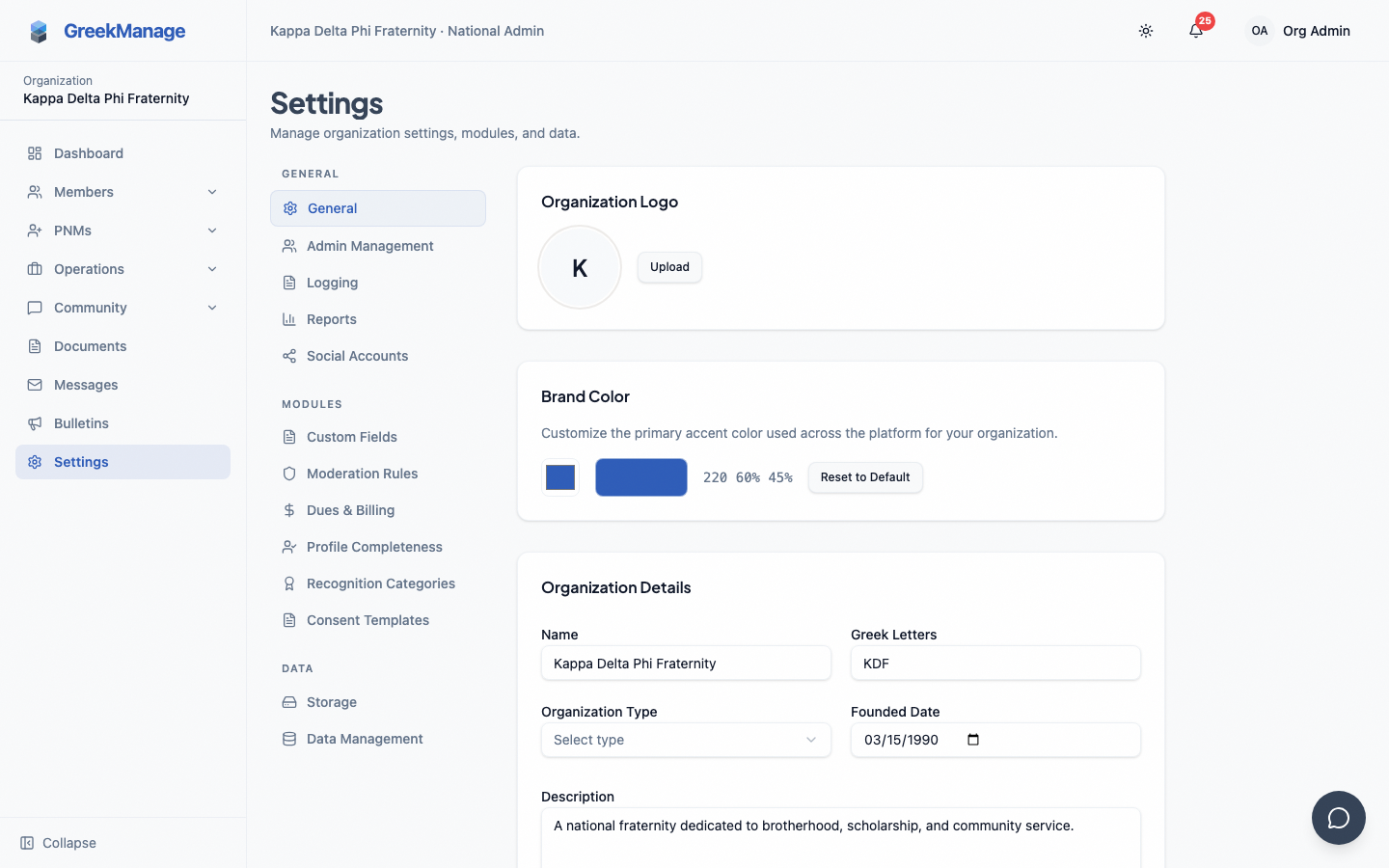 The org branding settings.
Upload a logo
The Organization Logo card shows the current logo and an upload/remove control.
- Click Upload.
- Choose a file. Accepted MIME types: JPEG, PNG, GIF, WebP, SVG.
- The file is sent to your configured object storage (MinIO, S3, or platform default — see Storage configuration) and the logo URL updates immediately.
To remove the logo, click Remove next to the upload button. The default initials avatar will be shown instead.
Set the brand color
The Brand Color card has a single native HTML color picker plus a swatch and the HSL value:
- Click the color swatch / picker.
- Use the OS-native color picker (it provides hex, RGB, and sliders depending on your OS).
- The hex is converted to HSL and stored on the organization. The HSL string is shown to the right of the swatch.
- Click Save Changes at the bottom of the Organization Details card to persist.
There is no live full-page preview pane and no separate hex/HSL text input — color selection runs through the OS-native picker. If you want to clear the override, click Reset to Default to fall back to the platform's charcoal indigo (215 25% 27% / #334155).
Organization details
The third card on the General page covers non-visual settings:
- Name (display name)
- Greek Letters
- Organization Type — Fraternity, Sorority, Co-Ed
- Founded Date
- Description
- Website
Click Save Changes to write all of these (plus the brand color) at once.
Social accounts
Social links are configured on a separate tab: Org → Settings → Social Accounts. Add links per platform (Instagram, LinkedIn, etc.) using the Social Accounts card.
What's not built today
- No live preview pane in the brand color picker — the color is shown only as a swatch + HSL string until you save.
- No org-controllable email branding settings page. Notification emails use a platform template; org logos and brand colors are not currently injected into outbound email.
- No batched app icon workflow tied to your org logo. The mobile app icon is set at build time by the platform team; changing your org logo does not update App Store / Play Store icons.
What can't be customized
- Typography (Plus Jakarta Sans headings, Satoshi body)
- Border radius and spacing
- Destructive/success/warning colors (kept consistent across orgs for usability)
Tips
- Pick a primary with strong contrast against white text for accessibility — your color is used on filled buttons.
- Use a square or roughly square logo — the navbar avatar slot crops wide logos awkwardly.
- Switch your account to dark mode before saving a new color to verify the result reads correctly.
Related
- Module enablement
- Storage configuration — uploaded logos use your S3 bucket
Last verified against v0.62.1 (2026-05-10).